Video Overview
Introduction
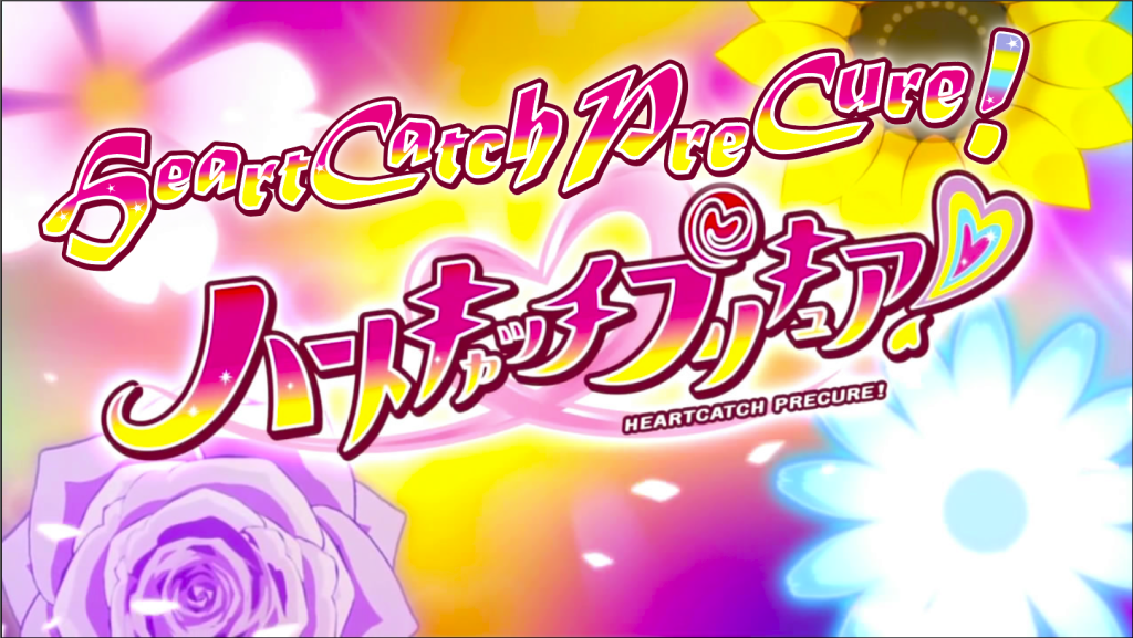
The Pretty Cure (or PreCure) franchise is an action and magical girl metaverse that has spanned 18 series in 18 years and has a much-dedicated fanbase. HeartCatch PreCure! is the seventh installment in the franchise and by far the best franchise series that developed a cult following. It was created by Izumi Todo and Bandai and produced by Toei Animation and Bandai. The show features two motifs based upon fashion and the language of flowers. HeartCatch PreCure! is also one of my all-time favorites in the Precure universe, so I was ecstatic to have the opportunity to recreate the title text for the English audience since the show has yet to come to America.
I chose to recreate the font in Illustrator. I wanted the English version of the title to reflect the show’s personality while also attempting to keep the curvy and sharp corners of the original text. For that, I decided upon Matura MT Script Capitals, because like the original Japanese font, it has pointed ends but rounded corners as well.
Formatting the Text

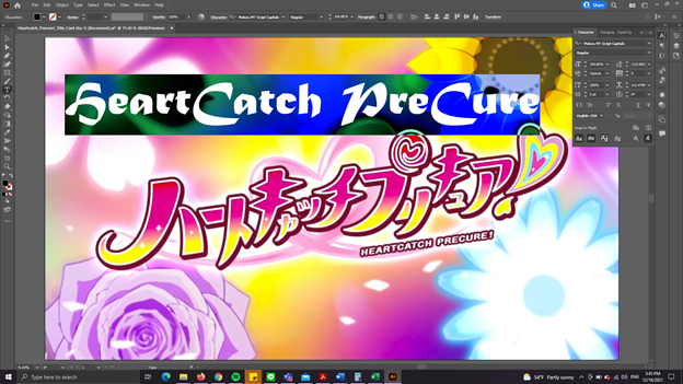
The original text is heavily stylized since Japanese does not typically italicize their characters. I rotated the text, and then, since Matura MT Script Capitals does not have an italic style, I used the shear tool to create the illusion of italics. I then started on the strokes. I first used the white stroke with a round cap, beveled join, and a center alignment for the first stroke. I made the second stroke thicker and used maroon to mimic the source text.
Afterward, I created an outline and ungrouped the words to manipulate the text individually. I extended the end of the letter ‘C’ to almost the end of the following letter. I also extended the letter ‘H’ at the end of ‘catch’ to mimic the curvy Japanese bottoms. I also enlarged the ‘H’ in ‘heart’ and extended the letter’s arch and tail to recreate the feeling of the first character in the source text. I then made the letters uneven in the line to mimic the original text.


Problems
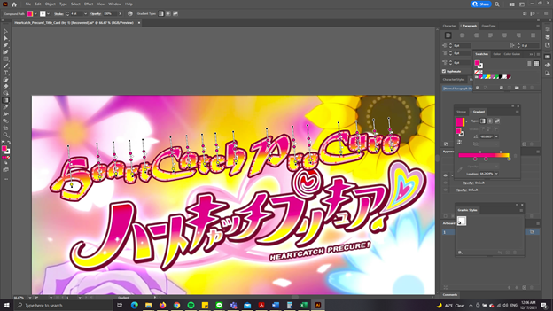
I had a tough time figuring out how to use the gradient tool on the ungrouped text, but after a bit of research, I realized that Illustrator could automatically apply the gradient to all of the text as long as the letters are highlighted. I used Fuchsia/Magenta, a lighter version of Fuchsia/Magenta, and Yellow as the gradient colors.
Another issue I had was learning how to add glow and drop shadow to the text. Thanks to tutorial videos, I discovered that I could layer the glow on the text to make the glow thicker without being overpowering by using Outer Glow. For Drop Shadow, I had to go to Appearance to figure out under which layer to apply the shadow so that it would not obscure the text.
Because I decided to add the exclamation mark last, I wanted to find a way to add the same style and graphics to the exclamation mark. Once again, after a brief research, I learned that I could use the Graphic Styles tool to copy the graphics to save time on recreating the same style with the exclamation mark. I then used the gradient tool to add the colors of the exclamation mark. Unfortunately, I could not figure out how to recreate the heart exclamation mark in the source text, so I used the linear gradient tool to stack the five colors together, one on top of another.
Final Touches
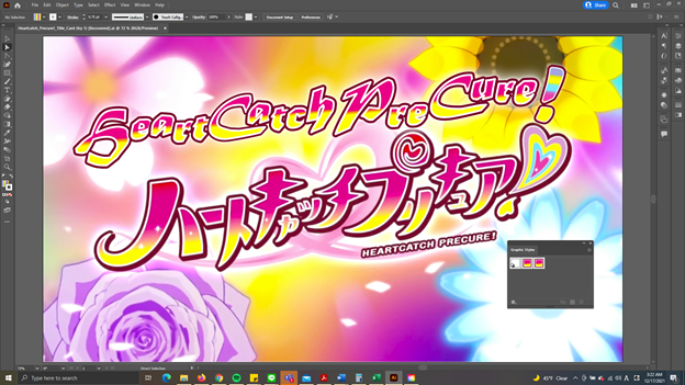
I then regrouped the entire text and added glow to the exclamation mark. However, there are sparkles within the text itself in the source text. To make the recreation as close to the source as possible, I researched how to create sparkles. I used the star shape tool to create a star with a white stroke and used the Pucker & Bloat to compress the star and force the stroke to lengthen.